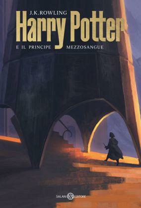
After more than 20 years since the release of the first book, Harry Potter is back with a new all-Italian look.
The world-famous Harry Potter literary saga, published from 1997 to 2007, has changed its look several times over the years. Sometimes we have seen covers with pop or or fantasy illustrations, other times realistic images or portraying the themes and characters of the books of writer J.K. Rowling.
This new edition sees for the first time a collaboration between the Salani publishing house and an internationally recognized Italian architect and designer: Michele De Lucchi. Author of some of the most iconic buildings in the city of Milan, including the Unicredit Pavilion, and of some design objects that have made history, such as the Tolomeo lamp designed for Artemide, Michele De Lucchi has collaborated with his studio AMDL CIRCLE and the Portuguese digital artist Andreas Rocha.

"Many and varied, many beautiful, are the covers of the Harry Potter saga," commented Mariagrazia Mazzitelli, editorial director of Salani. "What was still missing, however, was a graphic project created by an artist, an architect and a designer who would represent us internationally, an excellence of 'made in Italy.' Salani identified the visionary Michele De Lucchi: there is something 'Potterian' in the character, in the studio he directs, just look at his website. Our proposal was greeted with immediate enthusiasm and, right from the first meeting, the architect had a clear idea of how to create the covers. We worked with absolute harmony, putting together two teams - Salani and the AMDL CIRCLE studio - as if we were creating a building, using natural elements such as wood, landscape, color and light to amplify the reader's imagination and the imagery of Harry Potter. Because the saga itself is nothing but an exemplary architecture of words where everything holds together."
Each one of the seven volumes, in bookstores from January 21, depicts on its cover a series of dreamlike architectures set during the course of the day and located within epic and evocative scenarios. The covers are intended to narrate and accompany the reader gradually through the course of the story.

"Fantasy feeds fantasy," said Michele De Lucchi. "Visions feed visions. All our imagination is a process of transformation, a becoming that feeds on other visions that are consonant and not necessarily coherent. In the design of the Harry Potter covers, with my studio AMDL CIRCLE we have included iconic elements of our architectural research to amplify the reader's imagination and the iconography of the saga through scenarios never seen before, placing the fantasy genre in dialogue with contemporary architecture. The resulting settings are intended to create a bridge between the collective imagination about Harry Potter and the imagination of each of us. It was great to animate our buildings with J.K. Rowling's fantastic stories, because new imaginary landscapes were born from the interweaving."
Check out the gallery to see them all!


